Case study: Personal Bank Account Set-up
The product: Personal Bank Account Set-up
CCU is a local bank that wanted a website geared towards making it easier for their customers to get set-up with personal banking accounts online.
Project duration:
January 2023 to February 2023
Project overview
The problem:
Users need a quick and simple way to sign up for a personal bank account. They want getting signed up to be stress free.
The goal:
To create a website that keeps the proccess of setting set-up a personal bank account, simple and stress free.
My role:
UX Designer leading the app design from conception to delivery
Responsibilities:
Conducting interviews, paper and digital wireframing, low and high-fidelity prototyping, conducting usability studies, accounting for accessibility, iterating on designs, determining information architecture, and responsive design.
Understanding the user
User research: summary
I conducted initial interviews then created an empathy map to better understand the user. A primary group identified were college age students just entering the workforce and had need for a personal bank account.
The research revealed that the process is a not as straightforward as one may assume. Users wanted more of a step by step way of completing the process to avoid the usual stressful situations.
User research: pain points
College aged kids don’t always have the know how when it comes to setting up a banking account.
The set-up process can be quite long and daunting for the user.
Websites can be very clunky and over stimulate the user into a bad experience.
Starting the design
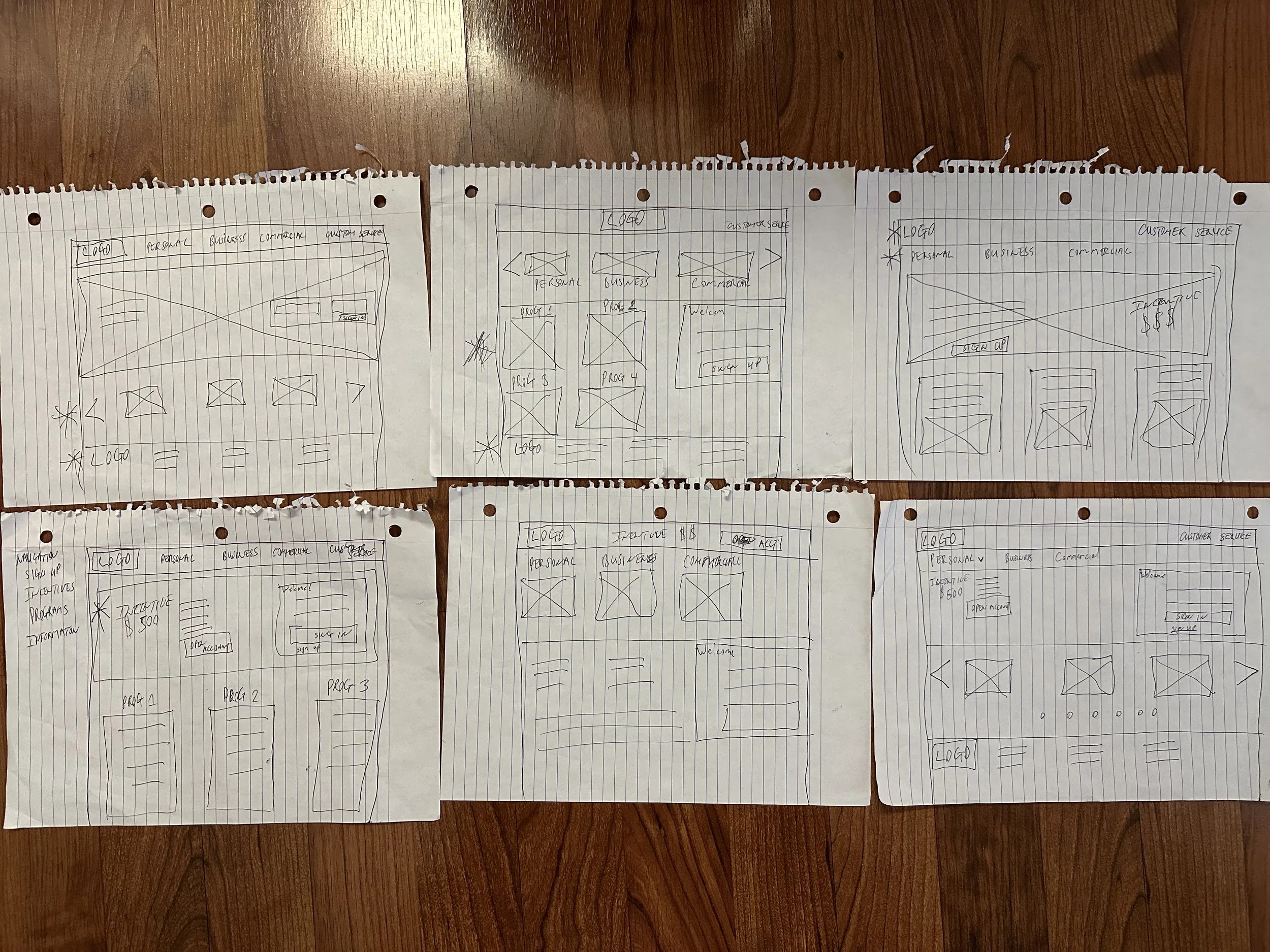
Paper wireframes
The goal was to come up with a viable solution that addressed the users pain points and increased the possibility of completing the user flow. Highlighting the personal account was the main goal in the earlier versions.
Digital wireframes
The goal is make it simpler for a user to set-up a personal bank account.
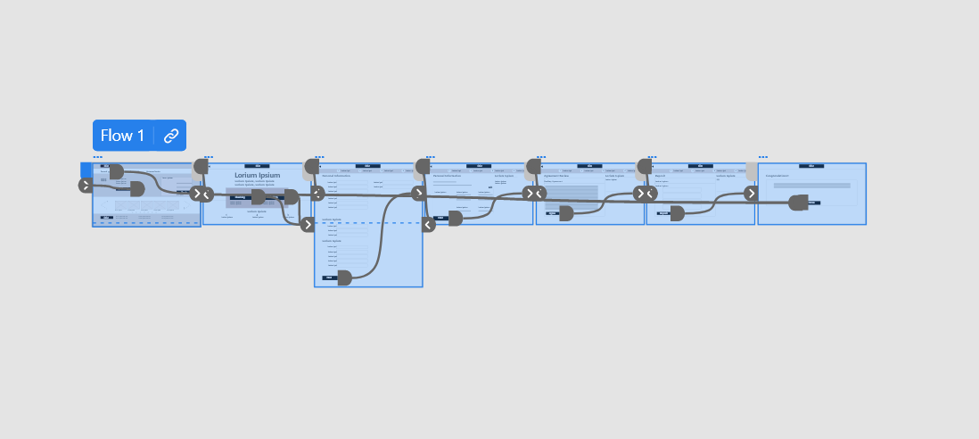
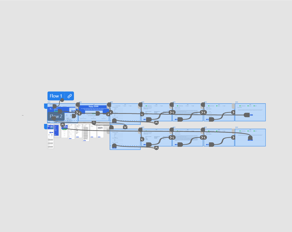
Low-fidelity prototype
This low-fidelity prototype takes you through the main user flow for creating a personal checking account and for creating a personal savings account.
Usability study: findings
Round 1 findings:
User wants links directly to respective personal accounts
User wants a concise sign up procedure
User wants to know what step of the sign-up process they are on.
Usability study: findings
Round 2 findings:
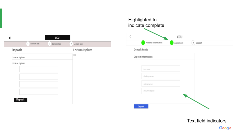
Users want deposit field text indicators
Refining the design
Mockups
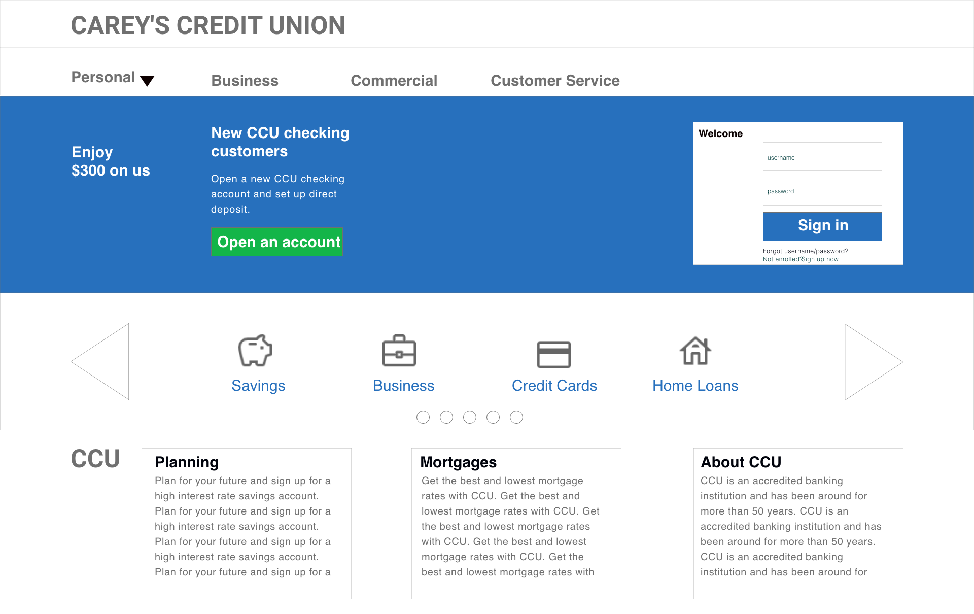
Before the usability study, the user would have to click the menu labeled personal and be taken to another page. After the study, a drop down menu was created to allow the user to choose their destination without leaving the current page.
Before usability study
After usability study
Mockups
Before the usability study there were no indicators as to what pages were already completed. There were also missing text field indicators. After the study, green circle indicators were used to signify completion of the page. Indicators were added to guide the user for text entry as well.
After usability study
Before usability study
High-fidelity prototype
This High-Fidelity prototype met the needs of the users by adding the iterations needed after the usability test was complete.
Link to high fidelity prototype
Going forward
Takeaways
Impact:
“I would use this bank to keep money safe”
C. B
What I learned:
Similarly to building an app, your users always have to be front and center. There is absolutely no substitute for good research. Building for all and not just a part of the user population is paramount. Forgetting accessibility standards is no no.

